The primary objective of this project is to introduce an innovative feature to Bumble that aims to attract new paid subscribers. The Common Paths feature, designed for Bumble, enhances the user experience by allowing individuals to log and share the places they’ve visited, creating a unique opportunity for connection with potential matches. By incorporating this feature, Bumble offers users a new, interactive way to discover common ground with others, fostering deeper connections through shared experiences.
For finding romantic relationships
For making friends and finding a community
For professionals to connect, share, and learn
As of early 2024, Bumble reported approximately 2.73 million paying users out of an estimated 58 million active users, indicating a conversion rate of about 4.7%.
The "women message first" feature is underperforming, as it fails to foster meaningful engagement, resulting in low-quality conversations. This diminishes user satisfaction and limits the potential for genuine connections.
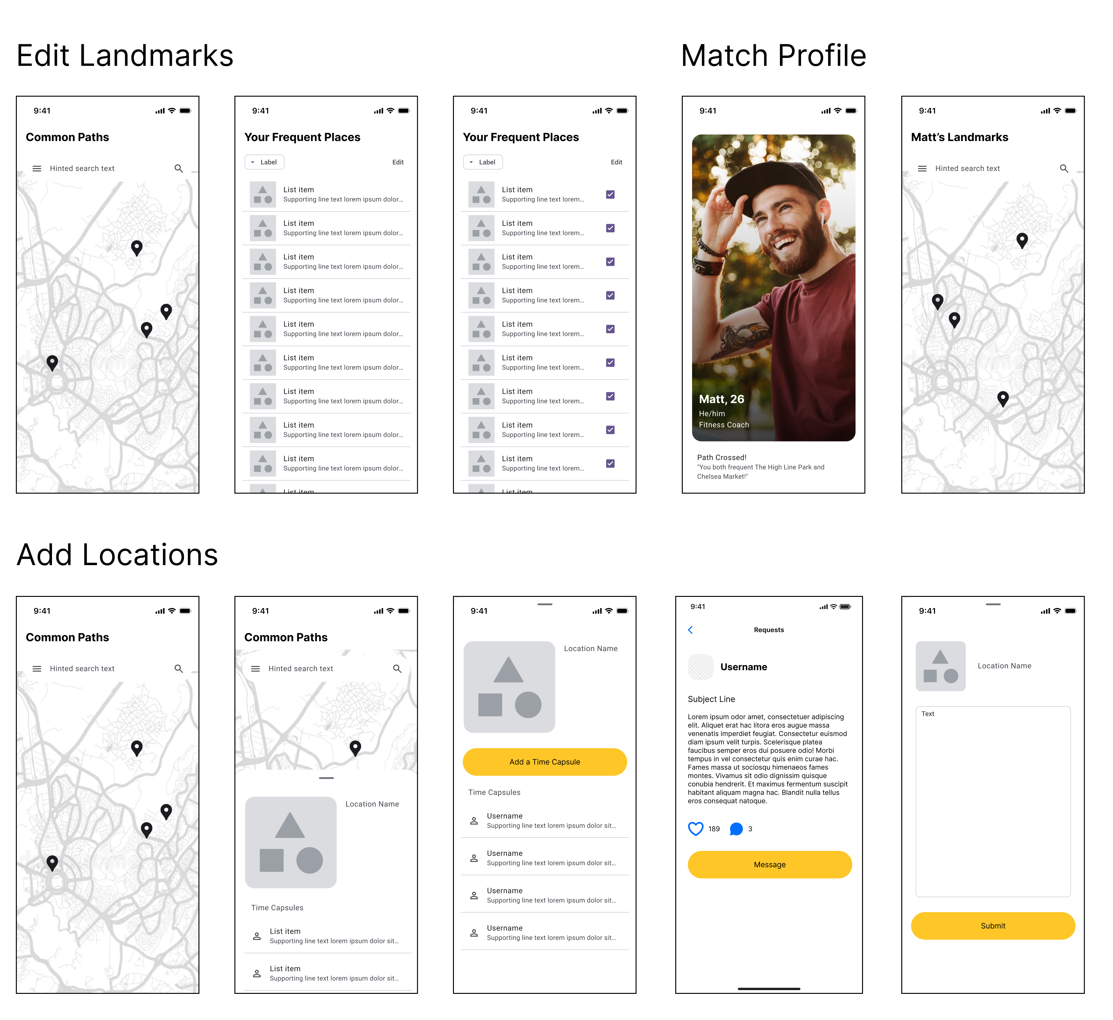
Users can manually log places they’ve visited, choosing locations that reflect their personality, hobbies, and favorite spots. Bumble also provides smart nudges, prompting users to add locations when they stay in one place for a prolonged period, making it easy to build a meaningful list over time.
Users have full control over their logged locations, allowing them to update, remove, or refine details as their experiences change. They can add personal notes, categorize locations with tags, and even adjust visibility settings for more privacy and customization.


A dynamic map highlights users' logged locations and shared spots with matches, fostering engaging connections. Users can explore their match’s notes on shared places for deeper insights, while a built-in prompt encourages conversations about mutual favorites.
Premium users gain access to an expanded view, seeing more details about shared locations, while freemium users get a teaser to encourage engagement and potential upgrades. Freemium users can explore shared locations with one match per week.


Instead of generic openers, referencing a shared location, like saying, "You love that bookstore too? What's your favorite find there?" creates more natural, engaging conversations. This reduces pressure and increases the chance of meaningful exchanges compared to a simple "Hey!"
Seeing shared locations makes it easier to suggest meet up spots, creating a natural transition from chatting to meeting in person. Whether it's a favorite café, a go-to gym, or a local park, Common Paths provides familiar, convenient meeting places that feel comfortable and low-pressure for both users.
Interactive location logging keeps users engaged beyond swiping and allows users to showcase their personality through these locations on their profiles.
Common Paths opens doors for expanding with additional features, including potential premium offerings. These sub-features can enrich the user experience, incentivize upgrades, and contribute to increased conversions and revenue growth.


User Flow Map
I created a user flow to indicate the main touch points a user would have with the Common Paths feature on Bumble. Yellow-filled boxes indicate the user's actions and gray-filled the screens that facilitates those actions.

Mid-Fi Prototyping
After researching user needs and design solutions, I began designing wireframes for adding/editing locations, adding notes, and matching. This helped me better visualize potential flows and consider specific aspects of the user experience in greater detail.
