This case study is password-protected.
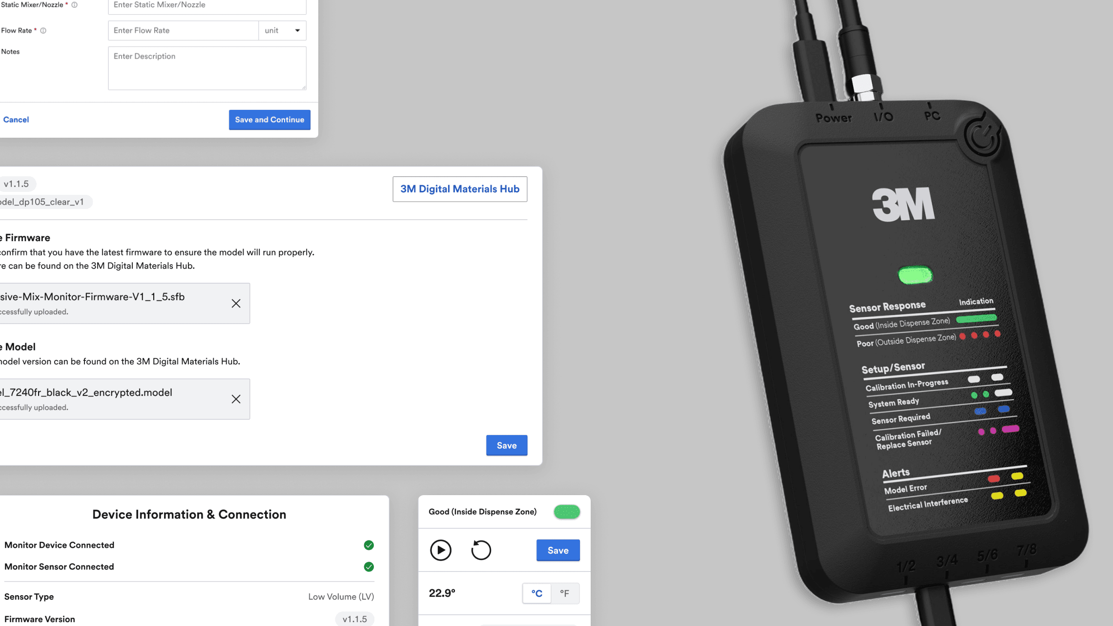
Adhesive Mix Monitor Software
Timeline
3 months
Role
UX Designer & Researcher
Tools
Figma, Figjam, VS Code, Agentic Coding
With
2 PM Interns 1 UX Design Intern
Overview
In preparation for customer release, I redesigned the entire software of Adhesive Mix Monitor. I designed new features requested by current users, added clearer navigation flows, made a leaner program, and applied an updated design system to its UI.
Context
Adhesive Mix Monitor is a released product with several parts to its function: an LED indicator and companion software that work alongside customers' adhesive dispensing machines. The software, however, is only released internally to 3M employees, and it's used to configure and monitor two-part adhesive dispensing processes on production lines. These are adhesives that can be used for something as small as golf clubs to big as airplane parts.
given brief
"Design a customer-ready UI for the Adhesive Mix Monitor System Manager's new monitoring and data-viewing features, using 3M's Jumbo design system, improved user flows, and support for fast, extensible implementation."
Auditing the Software & Shadowing Labs
Since I was a completely new set of eyes on this product, unlike my stakeholders, I went through the software myself to see their request firsthand and flag any other issues worth addressing in my work. I also went into the labs to see Adhesive Mix Monitor in action, where I had a change to talk to subject matter experts about their current experience with the product.

Prioritizing and Adding to My Initial Ask
From my audit and conversations with subject matter experts, I came up with more tasks to tackle in my redesign and then prioritized tickets with my PM.

reframing my brief
Rethink the software's entire user flow, reducing it to its leanest form, and ensure all current and new features fit within that structure. Maintain visual and UI consistency with 3M's ecosystem of digital products throughout.
key moments of my design process
Merging Firmware and Model Upload Steps
Talking with software developers surfaced a dependency I hadn't accounted for: since the program isn't internet-connected, users are responsible for keeping firmware and model files up to date and incompatibility between the two can cause errors. I combined both upload steps into one section so users can upload and see statuses both at a glance. They also share the same interaction pattern, uploading a file with a link to the 3M Digital Material Hub, so consolidating them made sense on that front too.

User testing
Ran my first iteration of redesign with 6 Application across 5 countries.
I focused on two core questions: would the new features feel usable and familiar to existing AMM users, and are the new flows and structures intuitive? I measured success on a Pass, Challenging, or Fail scale, looking at whether users could locate workflows independently and accurately interpret system status, controls, and information without guidance.
Finding the Light Guide
Finding: 5 of 6 participants could not find the light guide. Fix: I gave the light guide its own tab in the navigation bar, rather than inconspicuously on the side . I also surfaced the LED status directly on any screen where it's relevant, with a hover interaction that shows what each light pattern means and a description of the current status, so users don't have to leave the screen to understand what they're looking at.

Save Button Location
Finding: 6 of 6 participants struggled to find the save button at first. Why: Users expected the save button to be at the bottom rather than the top. Fix: I moved Save to the bottom of each accordion section, following users' natural scan path as they move through a section top to bottom.

Icon Comprehension
Finding: 5 of 6 participants didn't understand the icons at first. Why: Several icons looked similar enough to feel interchangeable. Fix: I redesigned the icon symbols to visually match the status they represent and removed colors to not clash with the LED pattern colors.

Final Designs
01. Make the Home Screen’s purpose clearer
The home screen was doing two jobs at once, navigation and a status check of the previous session's settings, but its cluttered layout made it hard to tell which one mattered in the moment. Navigation buttons also only existed here, rather than persistently across the program. Removed or repositioned elements so the home screen's primary job is clear: let users check their current settings and decide whether to keep or change them.

02. Adapting the Configuration Page to First-time and Returning Users
The step-by-step wizard worked for first-time setup, but returning users rarely change more than one or two settings, and the wizard still forced them through every step to get there. I redesigned it as an accordion with the wizard logic built in underneath: returning users can jump to any step directly, while first-time users still move sequentially, since each step stays locked until the one before it is complete. This cut 7 screens down to 1.

03. Compacting Chart Controls
The information and controls around the charts were taking up too much of the screen. I scaled them down and moved them into a side panel. The chart interactions themselves are still a work in progress since prototyping them fully in Figma is complex, so I'm using agentic coding to help build that out.

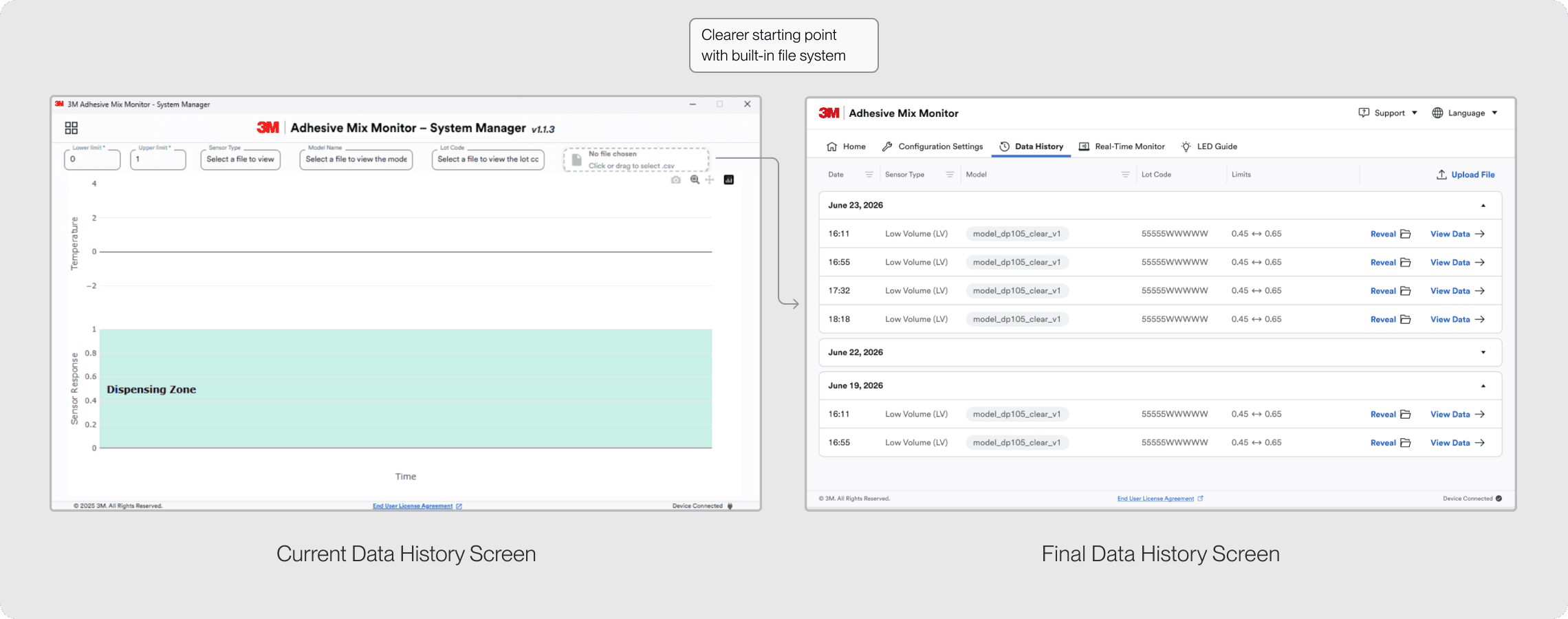
04. Turning a Blank Chart into a Native File System
Navigating to "Data History" dropped users into a blank chart with no clear starting point. I built a file system into the program instead, so users have recorded monitoring sessions to open rather than an empty screen. It also lets users organize and search files as they accumulate over time, all in one place.
05. Digitizing the LED Guide for Global Scale
With the LED guide set to be cut for globalization and printing costs, I moved it into the software and built out an iconography system to support translations and better internationalization. The digital format allows for more detail and instruction from the printed manual, content the original LED guide never had room for.

outcome
Handed off to Dev
I handed my designs to the developer and continue to work closely with them on QA and alignment. The introduction of 3M's Jumbo NPM package means the team can build faster going forward, pulling updated, standardized tokens and variables straight from 3M's design system instead of maintaining them separately.
Future Extensibility from Redesign
The redesign has a few practical implications beyond the screens themselves. Combining two applications into one reduces ongoing maintenance, and bringing the LED and LED Light Guide into the software improves internationalization. Adopting CSS variables and design tokens speeds up implementation and cuts future maintenance, while the reworked UI and user flows make the product more intuitive and customer-friendly overall.
Internship Extended & Next Steps
My internship was extended so I can see these designs through to launch and take on other 3M projects. From here:
The developer continues implementing the designs
I'm prototyping the line chart and its interactions through agentic coding
We're considering new LED statuses as new features require them
outcome
My first time designing for an industrial/manufacturing product
The stakes and context were different from anything I'd worked on before, users on a factory floor, hardware in the loop, and constraints I'd never had to think about.
The software doesn't exist in a vacuum.
A lot of what shaped good decisions was happening outside the screen entirely, on the production line, in how technicians actually work. Designing in isolation from that context would've missed the point.
Design with the dev's constraints in mind, not just after handoff.
Understanding what was actually feasible earlier in the process saved rework later, and made me a better collaborator, not just a better designer.