
ResearchLink
Timeline
9 Months
Role
UX Designer & Researcher
Tools
Figma, Framer
With
2 PMs 2 UX Researchers 1 UX Designer
overview
Research opportunities at Carnegie Mellon are highly decentralized, making them hard for undergraduates to find and navigate. Our team designed an interactive learning module that centralizes this information and guides students through the discovery process clearly and approachably. As Product Designer & Researcher, I led user interviews, contextual inquiries, and usability tests to uncover pain points, then synthesized the findings into journey maps that shaped our design decisions. I built and iterated on wireframes and prototypes in Figma, delivering an accessible experience that helps students confidently pursue research opportunities.
Impact at a Glance
Increased stakeholder visibility:
37% of new students discovered OURSD through the website.
Increased users’ confidence:
6.17/10 -> 8.58/10, reflecting increased preparedness to apply
Problem Statement
How can we help undergraduate students apply to on-campus research opportunities that align with their professional interests?
Learning How CMU currently present their undergraduate research vs. other universities
What CMU Can Learn from Others


Interviews with 3 OURSD staff says…
OURSD is the best way for students to find research
Solution must be low-cost and low-maintenance
Out of our hands after student apply
Learning from the Student’s Successes and Failures with finding research
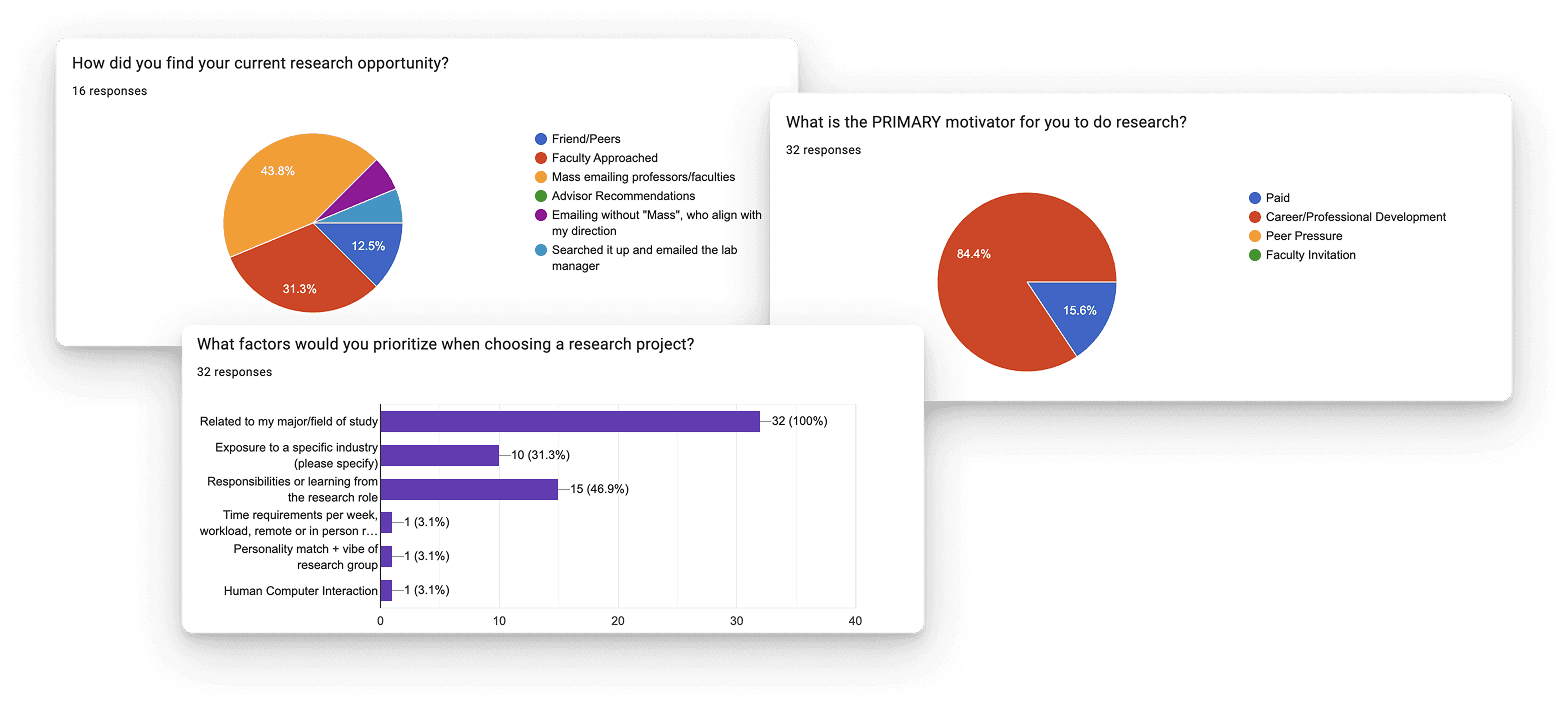
Interest in Research Topic is Important
Deep Nesting -> Lack of Visibility
Students are concerned about eligibility
Importance of Visual Organization
We surveyed CMU undergraduates on their experience finding research opportunities, collecting 32 responses across 8 schools. We also ran a think-aloud study simulating the full process, from initial curiosity about research to narrowing in on specific projects and identifying who to contact, so we could observe pain points and priorities at each stage firsthand.
Learning How CMU currently present their undergraduate research vs. other universities
An external web module to prepare students to apply to CMU's undergraduate research opportunities
Using card sorting to understand how users mentally group tasks
Card Sorting
Since our site would hold a lot of content, we needed navigation that let people find things quickly. We ran a hybrid open/close card sort: we came in with likely categories based on our content, but gave participants the freedom to create their own if ours didn't fit.

Information Architecture
From our card sorting, I was able to map out information architecture to help guide what pages we would need and how navigation would work.

Exploring multiple layout directions quickly to test assumptions
Based on our sitemap we made, we made a low-fi prototype to user testing. We wanted to make sure the flow makes sense and is what the user expects of the page to match.

Adjusting the prototype to align with user expectation and increase ease of navigation
From our feedback, we made changes to our sitemap to reflect that and improve navigability. Information felt too nested Change: 2 pages → 3 pages Emphasize importance of ‘Checklist’ Change: Intentional about the organization of information and hierarchy.

Wireframe Changes
A lot of participants emphasized the implied importance of a preparation checklist and they stated that they would go check the checklist as one of their first resources. In our low-fi prototype, important information were too nested which is exactly what CMU's website are. We don't want that, so we brought the checklist page to the home page.

When observing the participants' actions and words, we realized that some resources are more likely to be view/prioritized. So we reflected that through visual hierarchy.

The checklist is to guide students through a step by step process to prepare to apply to research opportunities. But the question format was confusing on exact the task was, so we changed the wording to be a statement/phrases.

Key Takeaways
Affinity clustering revealed three main takeaways: students generally had the right expectations for what each page would provide, effective visual hierarchy helped them navigate and understand content, and the density of information along with wording choices significantly shaped their comprehension. These insights emphasized the importance of balancing clarity, structure, and language in the prototype.
Final Designs
ResearchLink
An interactive web module that serves as a centralized hub, guiding students through every step of finding and applying to undergraduate research.
Home Page
A hub where you can find everything you need to prepare to apply to undergraduate research.

What is Research at CMU
Highlights how research varies by discipline and directs users to explore opportunities by selecting their department.

Preparation Checklist
Provides a checklist that guides a step-by-step preparation process for securing a research position.

Email/Resume Templates
Offers a collection of email and resume templates with examples to help students confidently prepare their application materials.

Resources/People
Provides resources connecting students to dedicated staff and advisors who can support them in finding and applying for research opportunities.

Reflection
My First 0 -> 1
Working in ResearchLink was my first ever experience launching a product 0 to 1 and that's invaluable. Thank you to my team of wonderful people and thank you to OURSD for partnering with us and allowing us to share this tool to so many undergraduate students at CMU!
